Image credit: Dice Insights
As an unpaid Apple developer1 I got the TestFlight invite to try Shortcuts on iOS. I’ve been testing the app for a while now so here are my thoughts.
Look and Feel

For the most part, it feels familiar to the Workflow app that is still on the App Store with a few minor differences:
Design
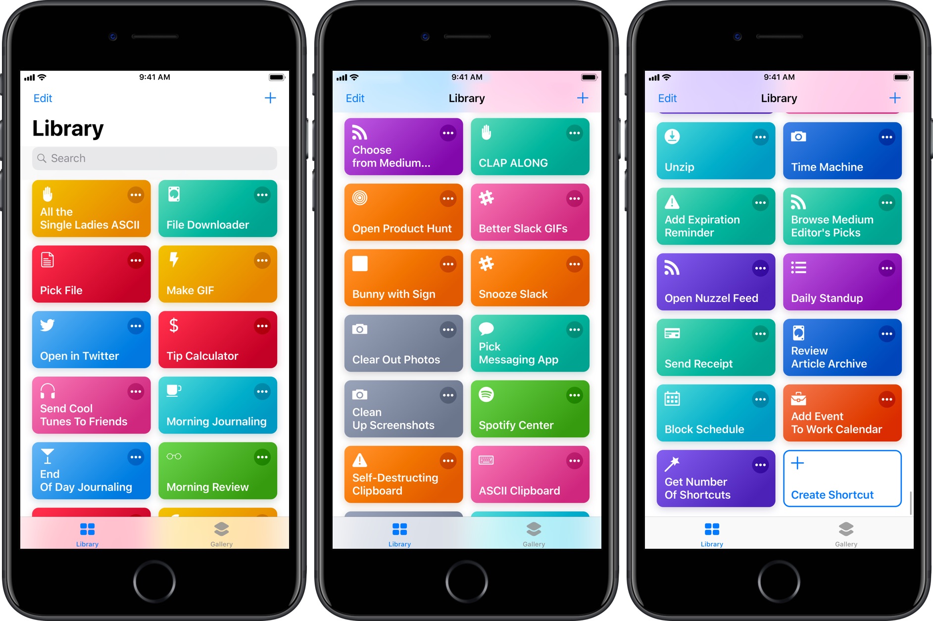
The design is more intuitive in Shortcuts. It uses the same card UI that is in some of Apple’s own apps.
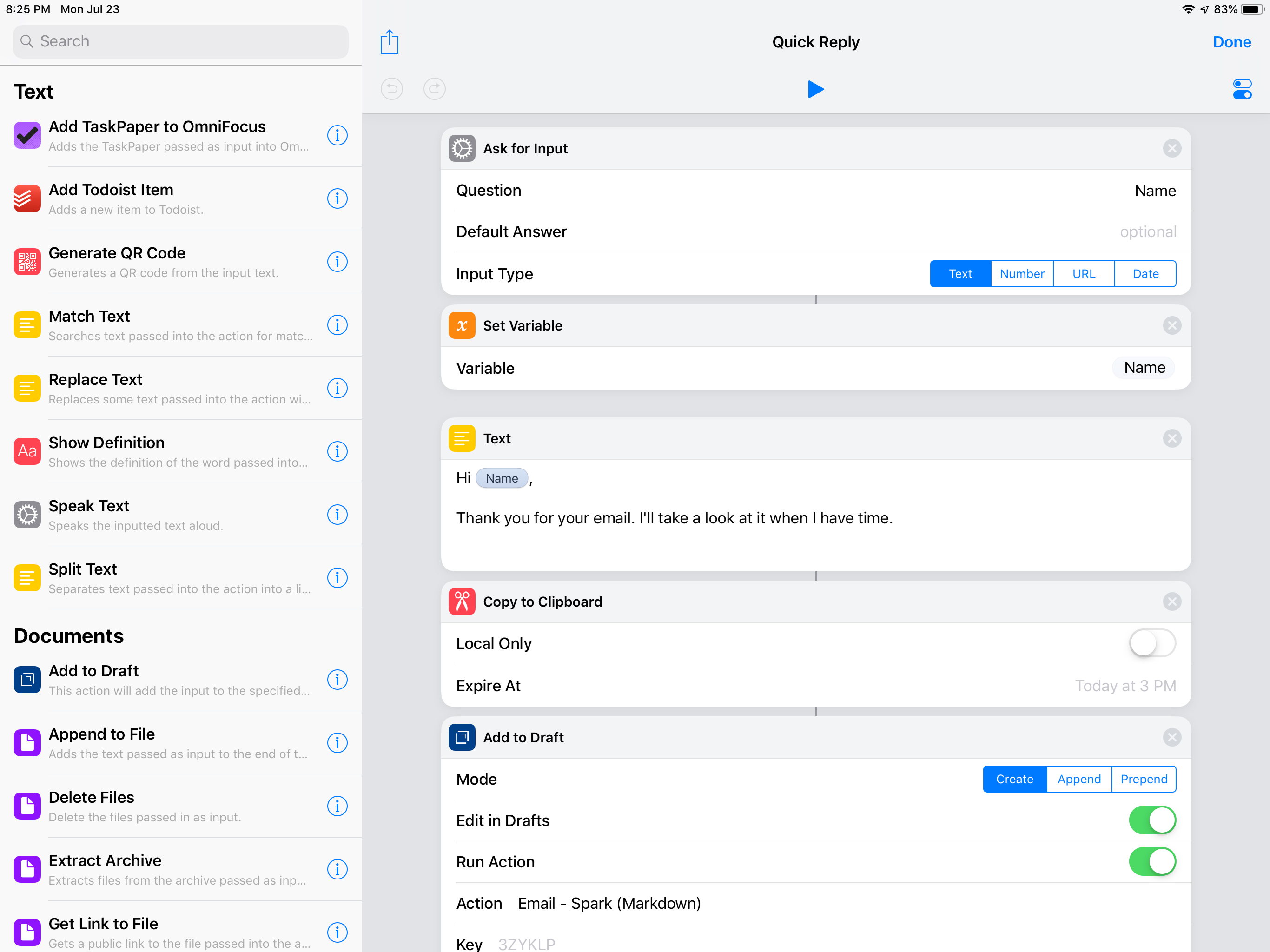
There is also an action drawer that you can swipe up from the bottom to access. This makes adding actions to shortcuts easy and intuitive.
Siri
In Shortcuts, you can add a shortcut to easily launch a shortcut from anywhere with a custom phrase.
I found this to be an easier way to speed dial a contact, and to access some of my other most used shortcuts.
The consensus seems to be this is how most people will interact with Shortcuts; they won’t download the Shortcuts app per se, they will see the context menus in apps that will allow them to add repeated actions to Siri from the app of their choice, as long as the developer delivers the intent for this interaction.
Same Workflow, Different Name

While Shortcuts is basically Workflow, there are some apps and actions you can’t access yet, for instance automation with IFTTT in the Shortcuts app. I rely on this integration to post links to LinkedIn from selected sources using Buffer however I am not sure if it is coming back. I’ll need to find a new way to do this from iOS.
Shortcuts v0.2: Solid Upgrade
I am hoping for syncing to come to the Shortcuts app as well as some other missing features and apps. For a beta release this is pretty solid.
-
Unpaid meaning I don’t pay to be a developer on their platform, at least not yet. ↩
Sign up for my smart home Substack
I enjoy writing and want to do it more. Join me if you like smart home content.
