I never liked dark UIs.
I love white backgrounds; crisp white UIs were 1 anathema to my dark former Android soul.
All my iPhones and iPads have been silver with white faces. White is chic. You get the idea.
When I was programming in Coda 2 on my Mac when I just started doing it, the UI was white. I showed someone a screenshot of it and they joked, real programmers use dark editors.
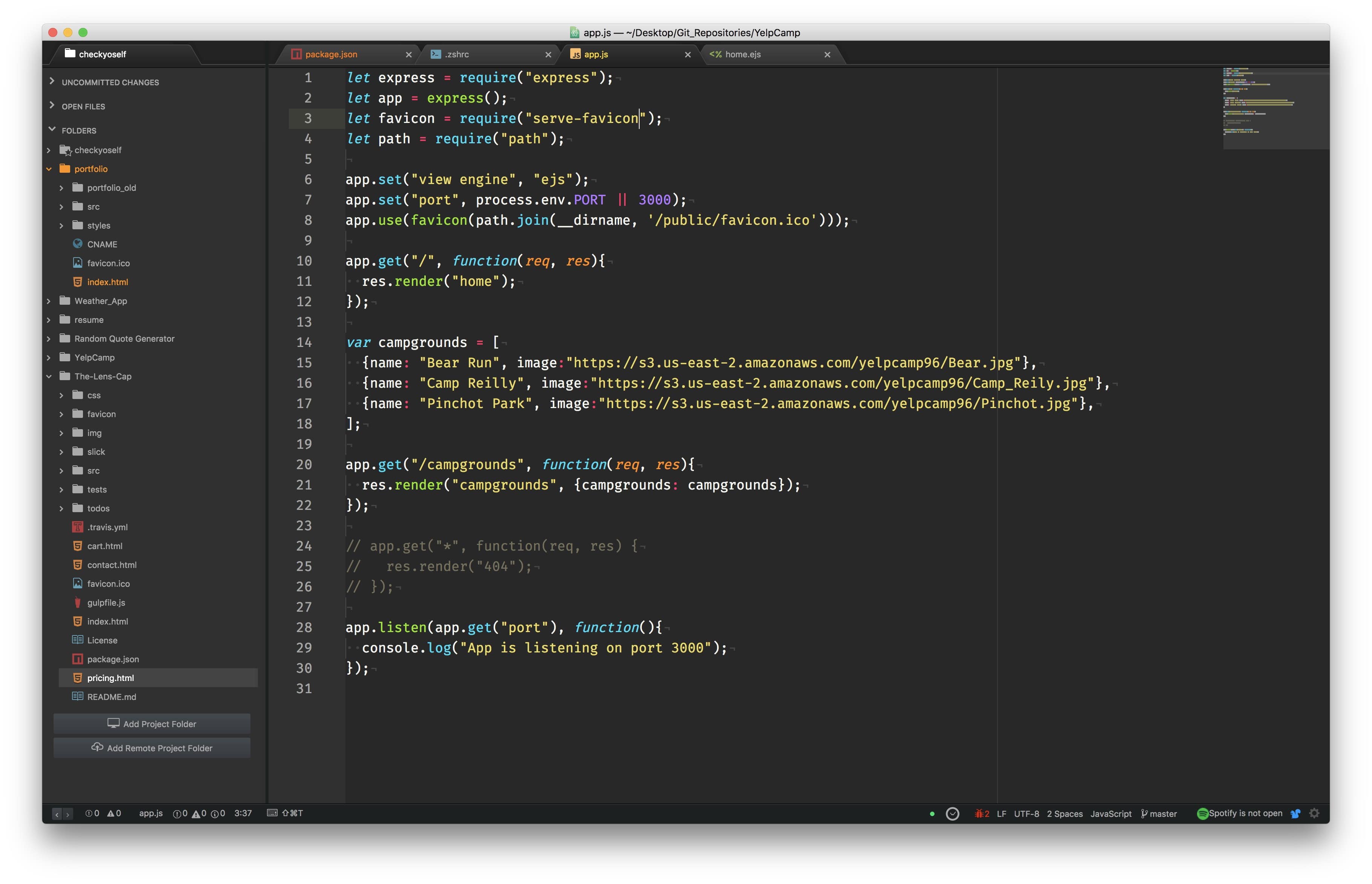
I couldn’t fathom that. I tried it. I didn’t like it. Not at first. But I added a theme to my editor called Monokai and the color. The contrast of the colorful fonts and functions, methods, etc, on a dark background hooked me.
Dark Everything
As someone who sits in front of a computer for long periods during the day, I need something that will take the strain off my eyes 2.
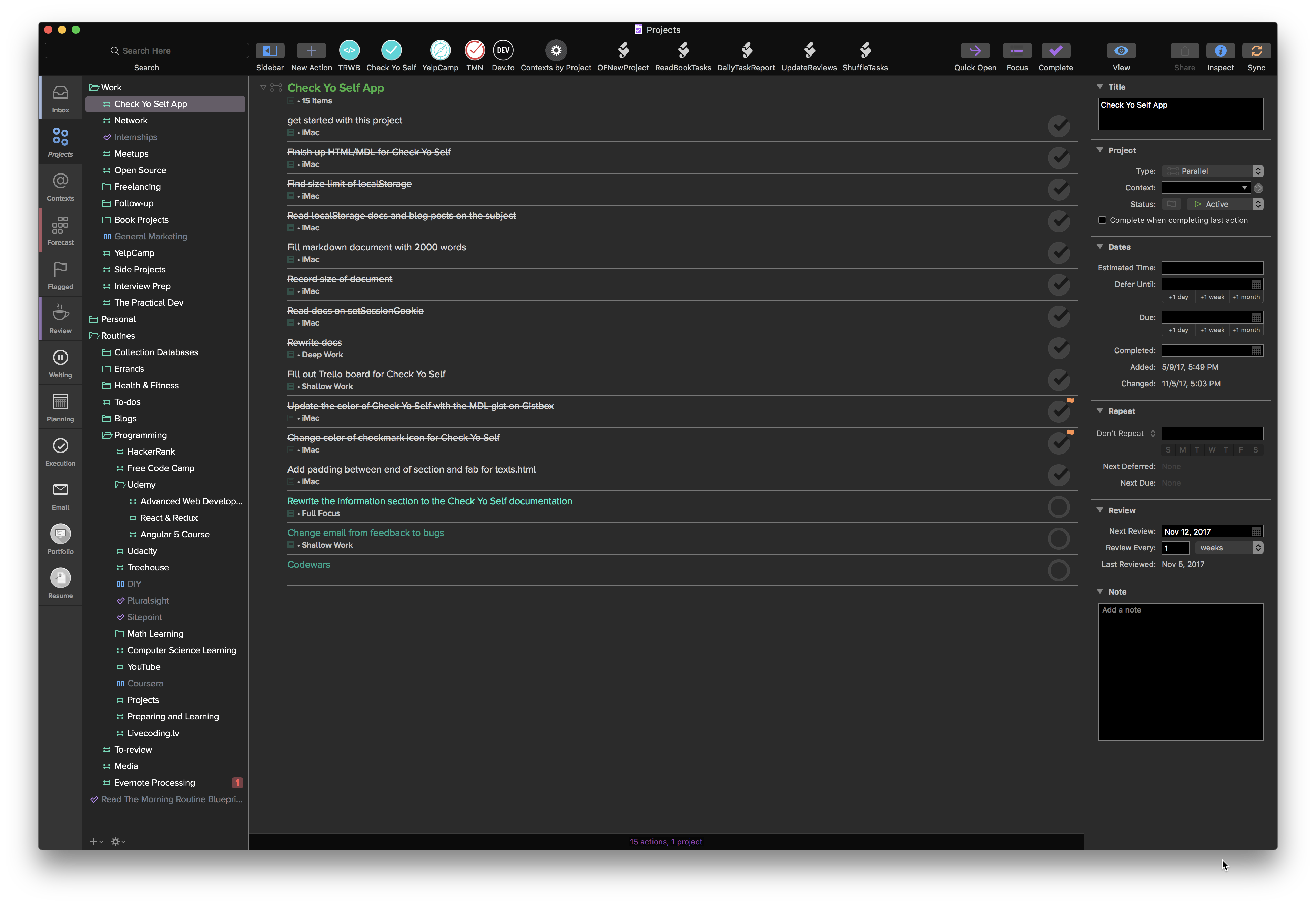
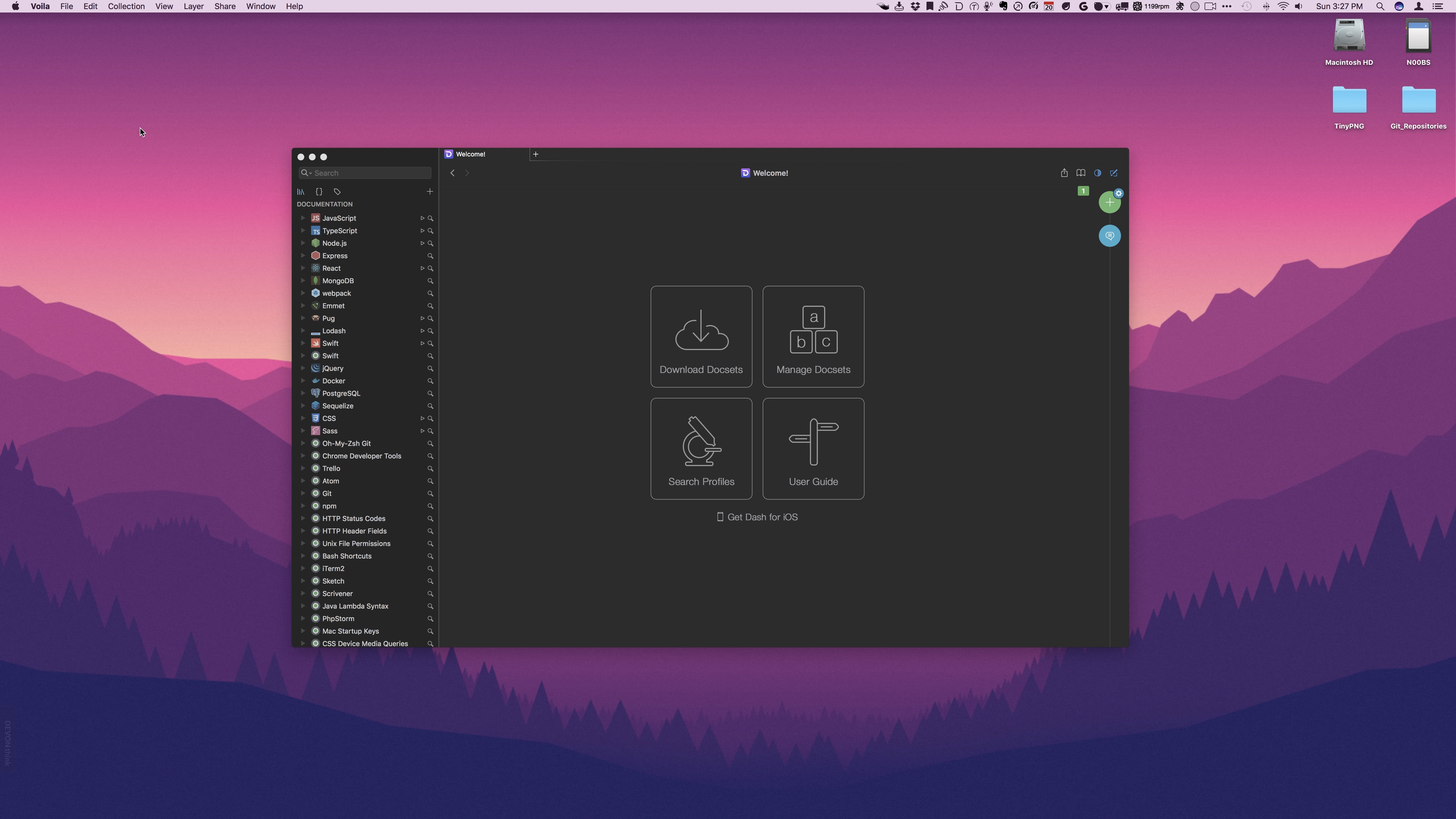
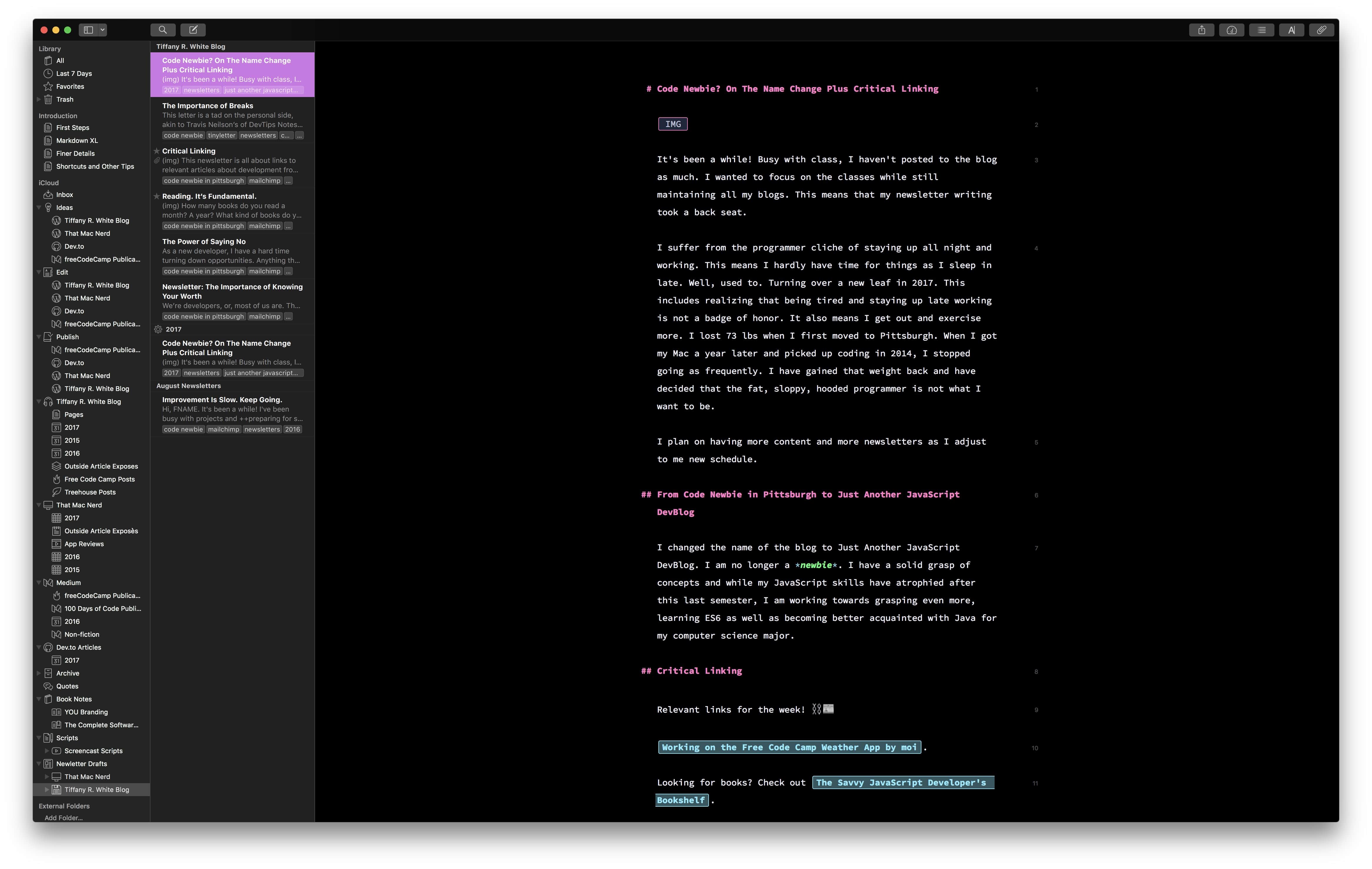
Dark UIs are perfect for this. And as you can see, I have it pretty much everywhere.
Sign up for my smart home Substack
I enjoy writing and want to do it more. Join me if you like smart home content.
